

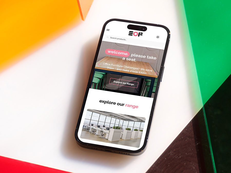


Flawless design, every device.

We build intelligent, fluid websites that perform at their peak on smartphones, tablets, and desktops alike.

A website that converts on every screen.

Our responsive designs adapt instantly to any device, ensuring your brand always makes a great impression.

Are you losing visitors because of poor mobile design?

If you are planning a new website, ensuring it features a responsive design is one of the most impactful decisions you can make to drive business growth.

We eliminate the frustration of viewing a desktop site on a smartphone. By removing the need for visitors to pinch, zoom, or endlessly scroll, we ensure your potential customers find your contact details and key information instantly, which helps prevent them from leaving in an instant.

Why mobile strategy matters

With everyone accessing the internet via smartphone, our mobile-first design can help capture that traffic. Being able to access information quickly on the go is now the expectation, not a luxury.

When we build your website to be fully responsive across all browsers and devices, we ensure your visitors have an effortless, high-quality experience that builds immediate trust. By making your content easy to read and navigate, we keep your visitors engaged and on your site for longer.

How we make it work for you

At the core of our responsive design service is a fluid, flexible grid. Rather than just shrinking your desktop site to fit a smaller screen, we craft intelligent layouts that automatically adjust and re-orientate for any device resolution. This approach ensures your brand always looks professional and remains fully functional, no matter how your customers choose to connect with you.

Mobile-ready website design is essential in 2026

We give you a website that caters to every visitor, regardless of the device they’re using. When we help you move to a responsive setup, we are doing more than just upgrading your tech … we are helping you grow your bottom line.

By ensuring your site works perfectly on mobile, we create an experience that keeps people on your page for longer. That extra time spent exploring your site is exactly what helps build a genuine relationship with your customers, ultimately leading to more sales and higher-quality enquiries for your business.

A beautiful, mobile-ready website that looks great at any size?
We got this.

The power of responsive web design.

Give your visitors the seamless, intuitive mobile experience they expect from a modern brand.

Optimised for instant action

Don't let clunky design get in the way of a sale. We create crystal-clear, easy-to-navigate interfaces that guide your visitors directly to the information they need, making it incredibly simple for them to convert.

Works perfectly on any smartphone

Our responsive websites use flexible, intelligent design that adapts instantly to any screen size. No matter where your customers are or what device they are holding, your brand always looks professional and accessible.

A frictionless shopping experience

Our responsive designs are built to make purchasing simple. By creating a smooth, intuitive mobile checkout, we ensure your customers never have to struggle to complete a sale.

Boost your conversion rates

When your content is effortlessly readable on any screen, visitors stay longer and engage more deeply, directly leading to more sales and enquiries.

Lightning-fast loading

Your visitors hate waiting, and so does Google. We design high-performance sites that are lightweight and load quickly, providing an instant, smooth experience for all your mobile visitors.

Maximum efficiency, reduced costs

Simplify your digital presence. By managing one single, responsive website instead of separate versions for different devices, you save significant time, effort, and budget.
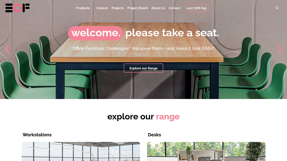
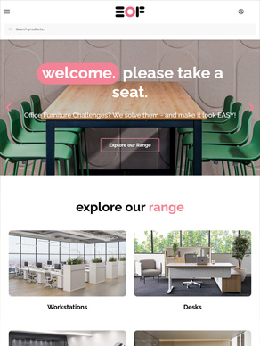
"We absolutely love our new website! Our previous website was clunky and had formatting issues. AusWeb Design created a slick catalogue website for our design agencies to find products easily, and order with a custom quote feature."
Gary
Easy Office Furniture

Responsive website design that helps you win more customers.

More people are browsing, comparing, and enquiring from their phones than ever before.

If your website is hard to use on mobile, potential customers may leave before they ever get to know your business.

We design responsive websites that look great and work smoothly across mobiles, tablets, laptops, and desktops. Every page is built to create a better user experience, make your business look professional, and guide visitors toward taking action.

From faster loading pages to clearer navigation and mobile-friendly enquiry forms, we help turn more mobile visitors into leads, bookings, and customers.

Don’t let a poor mobile experience hold your business back. We can help you create a website that performs beautifully on every screen.

Curious how your website could perform better?

Our free website audit identifies areas where your site could improve – from Google visibility to user experience and conversion opportunities.

Get a Quote

Let's Talk About
Your Website

Get Your Website
Fixed Now!

"*" indicates required fields

This field is for validation purposes and should be left unchanged.